Zone Manager: The Engine Behind D‑Limit’s Magnetic S/R
Every trader draws support and resistance lines. But teaching an algorithm to identify which ones actually matter—and track their strength as price interacts with them—that's the real challenge. This is the story of building a system that treats S/R zones like magnets: the more price is pulled to them, the stronger they become.
We're jumping in at Module 4, which makes up 1 of the 10 modules that allow the D-Limit indicator to function. I'm focusing on Module 4 mainly because I've spent significant time on its Support & Resistance code, and seeing it work was a real buzz. I want to get it in writing while it's fresh in my memory.
I've been day trading on and off for years now. I'm no way a professional, but I have an understanding of market dynamics, my emotions, and how hard it is to be profitable. I'm looking for an automated way to draw support and resistance lines to help provide data to downstream algorithms and eventually drive Spirit, my trade bot.
Some background on what the full D‑Limit technical indicator will do: Its goal is to provide a large dataset to help support the MACD trading algorithm. It has 10 modules; each module is responsible for a different aspect. In this post, we'll look at Module 4—the Zone Manager—where the indicator turns raw market structure into something actionable.
Zone Manager is the system that takes swing point data and turns them into support/resistance (S/R) zones, then tracks their "magnetic strength" over the life of the S/R zone. It also allows the zones to be presented in a Grafana dashboard for validation.
Zone Manager's Role
Traditional indicators like SMA, EMA, and ADX tell you trend direction, but they don't explain where price repeatedly reacts. The Zone Manager solves that gap.
It takes swing structure data from Module 2 (HH/HL/LH/LL) and turns it into zones that can be tested, ranked, and visualized. These zones become the backbone for D‑Limit's structural view of the market.
The end result: A cleaner view of where we have support and resistance bands. This creates a robust map that can help predict price behavior near S/R zones.
First Attempt: Support & Resistance Lines
The core function of the Zone Manager is to:
Create S/R Zones from swing points that are closely clustered or have multiple interactions with price:
- Price level
- Type (support or resistance)
- Magnetic strength
- Tests, bounces, breaks
- Created_at and last_test timestamps
Track Zones Over Time
Each time price retests a zone, the Zone Manager updates its stats. This builds a real‑world durability score rather than relying on one‑off swing events.
Classify Zones Intelligently (Zone Reliability)
Zones don't have fixed "support" or "resistance" labels. Instead, their role is calculated dynamically based on current price position—explained in detail below.
Boosted Zones
This is a separate function within the Zone Manager to pull out extreme highs and lows.
Zone Break Detection (Zone Reliability)
Logs when price breaks through a support/resistance zone.
Database Storage
Zones live in the magnetic_zones table, making them queryable, visualizable, and ready for downstream modules or even ML features (if I'm feeling brave).
Bounce Direction Analysis
Early in development, I explored using Bounce Direction Analysis to classify zones as "support" or "resistance" at creation time by analyzing how price bounced at each swing. The idea was to look at the actual price reaction—did it bounce up or down?—rather than relying solely on swing labels like HH or LL. However, I ran into a fundamental problem: zones don't have fixed roles. A price level at $95,000 acts as resistance when you're below it and support when you're above it. The same zone can flip roles depending on where price is trading.
So I took a different approach: zones have no type labels at all. Instead, their role is calculated dynamically based on current price position. This solves the classification problem entirely—the system doesn't guess, it calculates. This eliminates the need for bounce direction analysis altogether and ensures zones are always correctly interpreted in real-time.
Data Validation: Grafana Dashboards
As part of the testing, I wanted to see the output of each module. The testing process had a lot of green ticks—fully working and A-OK 👍 outputs—but I wanted to validate it with my eyeballs.
To do this, I needed a visualization tool: Grafana.
I have a bit of a love-hate relationship with Grafana, but I've invested a lot of time into it, so it's the tool of choice for right now.
Once the data was in the chart, I could see all the issues plain as day, and it was easy to drill into each problem. I'm a visual person, so this ended up being well worth the time, sweat, blood, and tears I put into it.
This was also a good lesson in making sure the code is doing what you think it should be doing before moving into production—seeing as all the test scripts were saying "You're the man, it looks great, let's go!"
It was clear the code was not ready.
Thank you, Grafana. 😄
The First Results
I'll create a separate post with a deep technical dive into the Zone Manager code, so let's keep it high-level and have a look at what was returned.
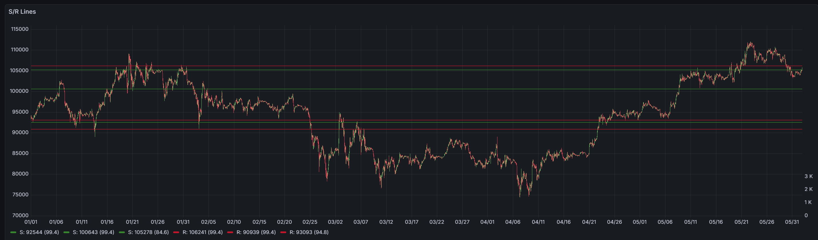
To create S/R zones, the Zone Manager needs to capture a large number of potential S/R lines. This is because at the point of creation, we're not sure if this new S/R zone will become valid.
To create an S/R zone, we need 3 swing points. I'm using 3 as this seems to be a good noise suppression value—much lower and the number of S/R zones increases dramatically. Later in the code you'll see a value of 2 is used for the extreme S/R lines, as I need more granular data at the outer price swings.
So using 3 seems to work and allows us to create a manageable number of S/R zones that we can now "add" strength to. This allows us to highlight the important zones. We add strength via the magnetic calculation function to relevant zones. This builds a strength index and helps highlight only the important zones, leaving weaker zones to fade. We can then use these strength values to identify which are true S/R zones and which were just noise.
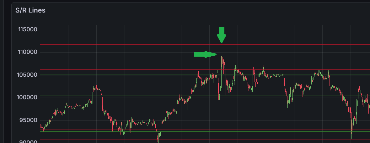
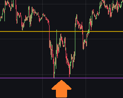
You can see from the chart below that we get an almost spot-on result (in my opinion). If I wasn't such a perfectionist, I would let the double lines flagged in green go completely.
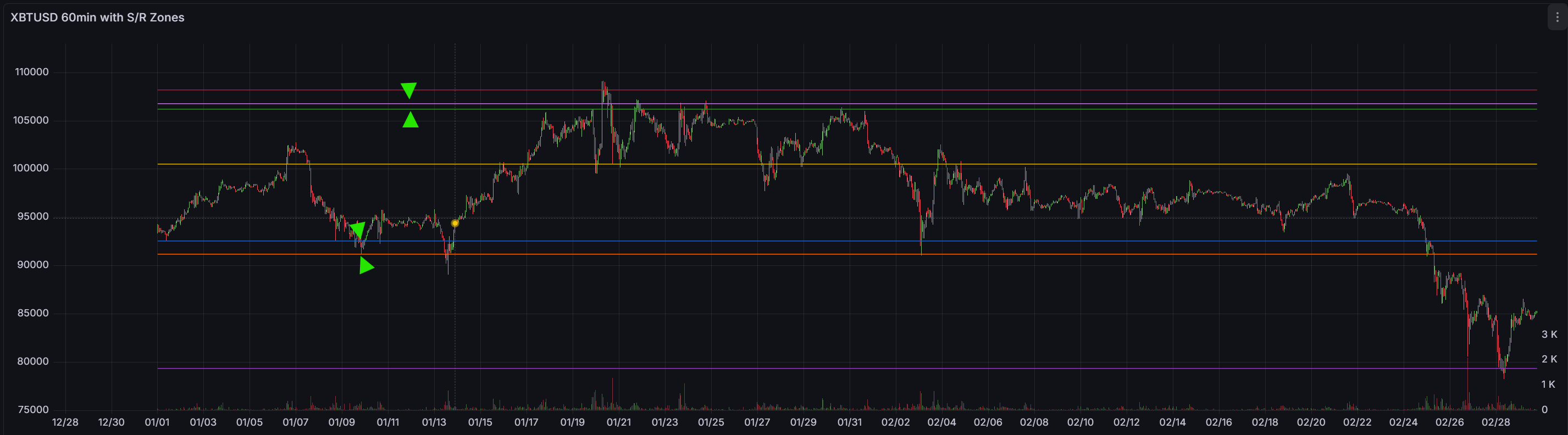
0.5% Threshold
But I can't let it go! These double S/R lines need to be looked into. The Zone Manager is allowing strength to be built, and the bounces part of the S/R is correct. However, the S/R lines are just over the 0.5% threshold apart from one another, allowing them to be presented as separate lines.
No problem—just bump this to 0.7% and it will be all good, right?.......
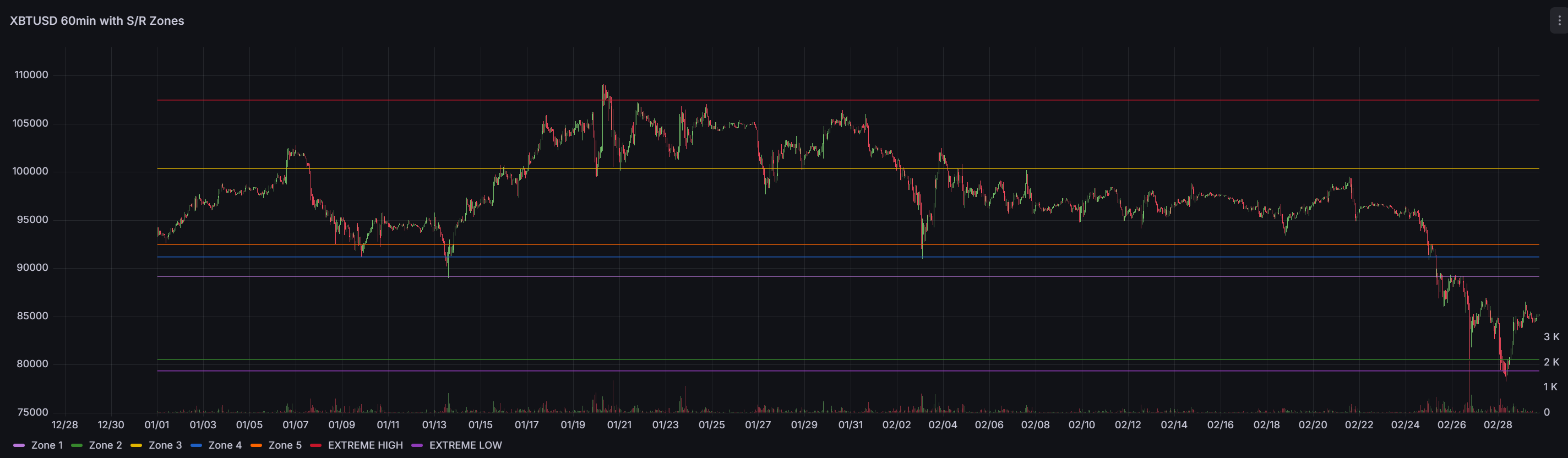
0.7% Threshold
Wrong!
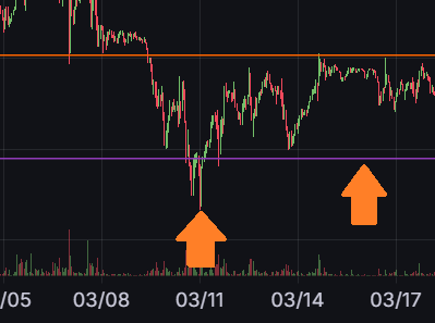
I'm getting that sinking feeling where you "just" need to tweak this number to make it look better. Let's stop and revisit the logic. With the 0.7% threshold, you can now see we have a new problem: 3 S/R lines in the centre of the chart!
Time to Fix: Clustering Algorithm
After testing the "quick fix" (bumping 0.5% → 0.7%) and finding no improvements, I realized I needed to look deeper. The problem wasn't the threshold percentage—it was the clustering algorithm itself.
The Problem
Those double S/R lines were appearing because the system was creating zones at slightly different prices when they should have been grouped together. I discovered the clustering logic had a critical bug:
The Bug: Chain-effect drift. The clustering compared each new swing to the last swing in the cluster instead of the cluster's centre. This meant swings could gradually drift apart. For example: swing at $90,000 → $90,500 → $91,000 could all end up in the same cluster, even though the first and last are $1,000 apart (well over the 0.7% tolerance). This created duplicate zones at nearly the same price.
The Fix
I needed to give the clustering algorithm an complete overhaul, a fundamental change to the logic. Now we compare each new swing to the cluster centre (the mean of all swings in the cluster), not the last swing.
_find_clusters sorts pending swings by price, then builds clusters by comparing each new swing to the mean of the current cluster. If the distance exceeds base_tolerance_pct (0.5%), it starts a new cluster. This prevents drift—if the cluster mean is $90,000 with 0.5% tolerance, ALL swings must be within $89,550-$90,450.
_try_create_zone averages the cluster to get a zone centre, then checks if a zone already exists at that price. If it does, it updates the existing zone instead of creating a duplicate. If not, it creates a new zone with initial strength based on the cluster size.
add_swing checks if the swing is inside an existing zone; if so, it records a test/bounce and updates strength. Otherwise, it adds the swing to pending_swings, triggers clustering, and creates zones from any clusters that meet the minimum tests requirement (3 for regular zones, 2 for extremes).
This fixed the double lines issue. Zones now cluster tightly around price levels, and duplicates are prevented by checking for existing zones before creation.
Dynamic Zone Roles
One more important design decision: zones don't have a fixed "support" or "resistance" type. Instead, their role is calculated dynamically based on current price. If price is at $94,000 and a zone is at $95,000, the zone is resistance (it's above us). If price climbs to $96,000, that same zone becomes support (it's below us). This eliminated the need to classify zones at creation time—the market tells us what role each zone plays right now.
Filtering Noise with Magnetic Strength
How do we filter the noise out and focus on S/R lines that other humans will be using? Good question. This is where the magnetic concept comes into play.
Magnetic Effect
The idea was inspired by the pull of magnets. The closer price comes to an S/R zone, the more it adds to that zone's strength.
Here's how it works: When a new HH or LL is created, the swing gets added to a pending_swings list—not a zone, just a pending swing waiting to see if other swings form nearby. Once 3 swings cluster together at similar prices (within 0.5% of each other), a zone is created. At creation, the zone has minimal strength—just the base strength from having 3 tests.
The magnetic effect kicks in after creation. As price approaches the zone, it enters the "magnetic field" (the tolerance band around the zone's price level). If price bounces away from the zone, the zone's strength increases—this is a successful test. The more price interacts with and respects the zone, the stronger it becomes and the more prominently it appears in the chart. Zones that price ignores or breaks through lose strength and fade into irrelevance.
Boosted S/R Lines
However, there's an issue with the above approach: extreme high and low zones fail to build strength. This is often because of limited price interaction at extreme levels. Price jumps up, gets rejected, then tumbles down—leading to little magnetic interaction with the S/R zone. But these extremes are important pivot points.
The solution is to allow the Zone Manager to automatically detect which zones are near the absolute highest or lowest prices and boost their strength. This boost is dynamic—it tracks the current extreme high and extreme low in the dataset. If a new extreme appears (price makes a higher high or lower low), the boost shifts to the new extreme zone. This approach helps address the lack of price interaction at extremes while keeping the boost focused on the current market boundaries.
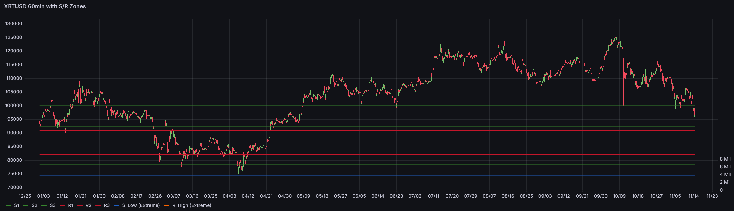
Now I'm expanding the data range to include 2025 Q1 & Q2 to see if, with more swing points, the S/R zones still look good.
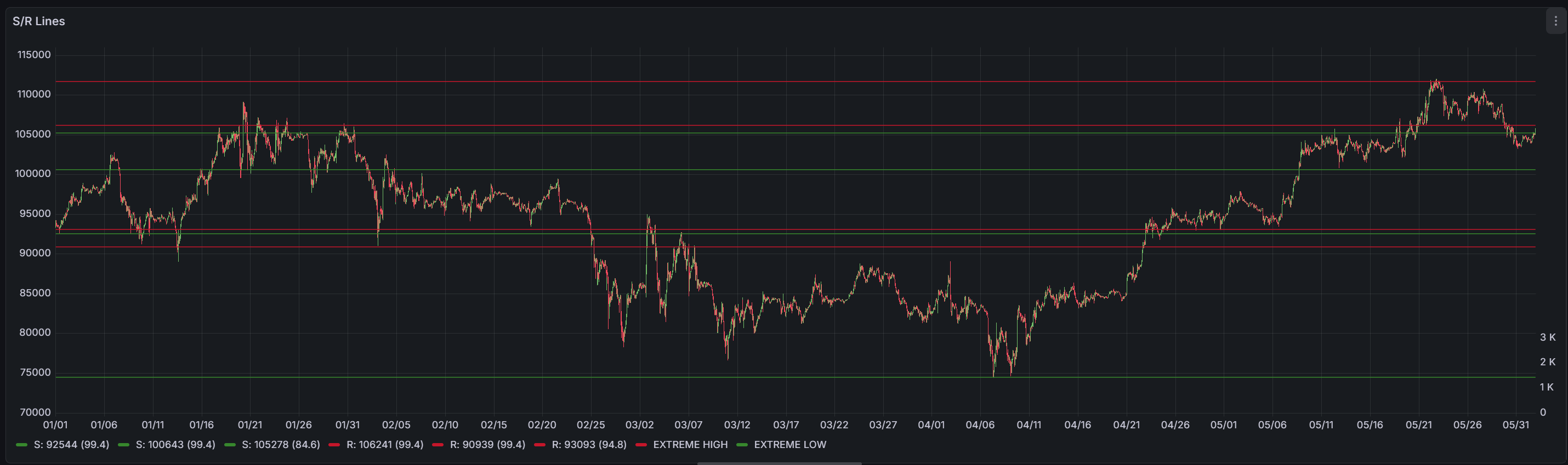
OK, the outputs are looking good. With more data, I see a slight issue with the extreme highs. If we keep to the Q1 time frame, the extreme highs are above the very top price level in the Q1 frame. This is because we now have more data (Q1 & Q2), a larger dataset. We now have a new extreme high in this dataset, so we're just seeing the new S/R line set by data outside of this time range. Let's make a note of this—it's not a showstopper at this point.
However, the extreme low seems off (not showing on the above chart). It's not as extreme as I think it should be. This is because of the zone creation logic: it requires a minimum of 3 swing touches to create a zone.
This is a good threshold for regular support/resistance levels—we don't want to create zones from random price touches. However, market extremes are different. By definition:
- There's only ONE absolute high and ONE absolute low in any dataset
- Prices may rarely test these levels repeatedly before reversing
- Extremes may not reach the 3 required touch points to confirm a zone
So our quality filter seems too strict for extremes, causing us to miss these S/R zones altogether. Let's make this a dynamic minimum test.
Instead of a fixed "3 swings for all zones" rule, let's look at a context-aware approach for just the extreme logic. When a swing cluster is within 1% of the absolute highest or lowest price in the pending swings, we allow zone creation with just 2 touches. Regular zones still require 3 touches to maintain quality.
At this point, I'm happy with these S/R zones. I still have an issue with the strength becoming maxed out. The current max value is 150, and I seem to have over 10 S/R lines hitting this limit.
So let's see what happens if we remove the strength caps from the Zone Manager. I don't feel that we need to cap the max strength, as over time we can keep building the relevance of S/R lines by adding more strength to the zone if price is affected by it.
Uncapped Strength Results
The result: I gained 5x more strength in some of the S/R zones. Zones that had been maxed out at 150 were now over 800. However, I seemed to have ended up with a "dead zone" in the middle of the chart. Looking at the data, we now have a lot of lines, but they're still in the right locations.
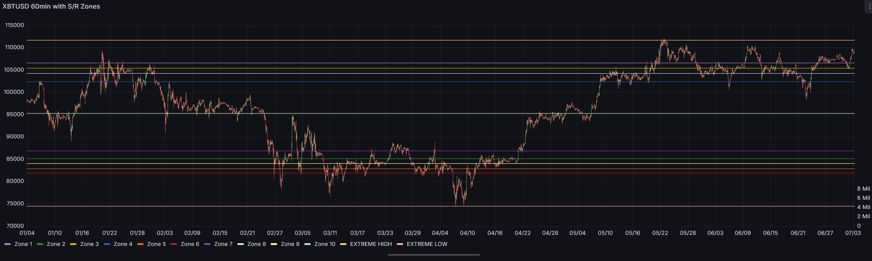
When I draw my own lines, the price doesn't always hit them 100% spot-on it falls short or overshoots my lines. This is often by a small percentage, so I think it would be interesting to see how this chart performs. The data is going to be fed to downstream algorithms and or ML, so let's not get too hung up on the look.
I'm just validating the data. I think a filter may be a better approach so that we can leave the raw data as-is. The filter can present the S/R lines as I would like to see them and preserve the raw dataset for later in the process.
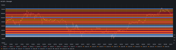
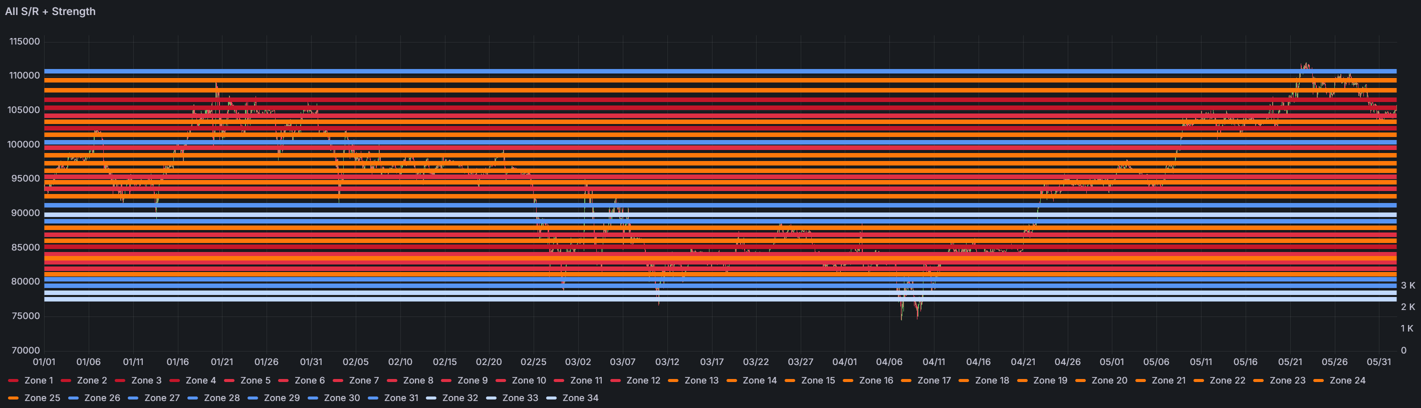
On a separate note, let's see what happens if we view the S/R lines not just by price point but colour the lines by strength as well. I'd like to see if there are any patterns we can spot from this new overlay.
Colour-Coded by Strength
I'm happy with this output. I can now see that the deep red lines are the strong S/R lines, and these are where we're seeing price support/resistance. The light blue at the top and bottom fits into what we discussed about price extremes, and the section of blue in the mid-range shows low strength in this part of the market.
So I think this is done!
What's next, I think we now need to backtest the output from the zone manager to see if we are able to predict price movement.
Current State of Module 4
Status: ✅ Validated